Friday, September 30, 2005

Break Time! Photo Group

Example
Photo taken at a local school
Example
Photo taken at a local mfr. facility
Example
Note the break table near the bldg.

Awhile ago I created a Break Time! photo group at flickr.com. These are 3 images from my collection. For some reason I like seeing where people take their breaks at work. It's kind of fun to imagine what it would be like to work where they do.

Thursday, September 29, 2005

Archived Art - circa 1995 Humor Illos

Example
Example
Example
Here's some more "ancient" illustrations from portfolios past. I used these for promotional mailings.

Wednesday, September 28, 2005

Archived Art - circa 2000 Dairy Wagon

Example

Here's a pencil drawing I did back in 2000. The company I work for was going to use it as a thank you gift.

Unfortunately, pencil drawings don't scan or photograph well. So it doesn't look very good here. Anyway, this piece was created to be given as a fine art print to our dairy customers. The cool thing is, I'd hand draw the customer's logo, scan it and place it on the side of the wagon before printing the entire drawing out on our top quality printer. Basically we were creating a customizable fine art print for each of our customers.

Tuesday, September 27, 2005

Video Blog - Hippie Yard Sale


This yard sale was great. They had an old gypsy wagon and lots of strange movie type promotional props for sale. The sad part was everything looked like it was in dire need of repair.

I believe this sale was on Blue Star highway (if there is such a highway) going north from Kalamazoo to South Haven. I shot this quite awhile ago so I'm not sure the place even exists anymore.

Monday, September 26, 2005

SUMP! Project Update

Example
Example

The Vote SUMP! project idea (posted 9/19/05) is well underway. I've made some modifications, most notably, to the character's face. I've also changed the VOTE SUMP! concept to SUPPORT SUMP! Obviously no one will be able to vote for sump. So support sump made more sense.

Two slogans have been created: "Join the Movement" and "Sump Has My Business" (i'm sure you get the references)

The above images are a couple T-shirt designs. I wish I could create my own shirts and leave them around town for people to find. Obviously too costly and time consuming. So I set up a cafepress store instead. I'll post the link when it's up and running. (I'll also be offering bumper stickers and other assorted "campaign" items). I wish I could just provide those items at my own expense. Obviously that's not realistic.

I'm thinking about running a couple anonymous ads in our local paper depicting SUMP but with no explanation. The ads are really cheap. Some as low as $10.00 (business card size ad)... the only problem is the ad people at the local paper ask too many questions. Time will tell with that one.

a www.supportsump.com micro web site may become a reality. The design studio I work for has agreed to buy the domain name, host the site and provide coding support. It's highly likely there'll be a mini-game with SUMP running around catching sewage in a bucket.

I'm glad the idea hit me during September and not October. It'd be NO fun trying to roll out an ambitious project like this in a couple weeks. At least now I can plan out everything for maximum impact. Worse case scenario I can always resort back to leaving yard signs around town (which I'm still going to do).

Friday, September 23, 2005

Don't Even Think About It

Example

People will generally agree to any request as long as it's reasonable.

However.....

On my way home from work one day I decided to stop by the salvage yard and ask to walk around and take some photos of rusty stuff. So I walked in the office to get permission and noticed 5 guys with their feet up on 3 desks. I Knew right then they weren't going to allow any photos to be taken. Since I was pretty far into the office I had to ask anyway. So I did. Apparently one guy didn't hear my request and asked me to repeat myself. You know how it is when you're asked to repeat yourself, you sometimes speak louder and you comes across beligerent. That's exactly what happend. I may as well asked the guy to "get your carcass outside because I'm prepared to pummel your sorry butt" instead of the actual passive, humble words asking his permission. So that didn't go too well. Of course I was denied access.

I did learn a valuable lesson about myself from this little incident. I've discovered I'm still a reasonable person but, more importanly I'm also slightly passive aggressive.

In order to spare anyone else the embarassment of asking permission I've included a photo of the salvage yard. So I strongly urge you not to even think about taking a photo of this salvage yard. It's off limits. Under no circumstance should anyone ever take a photo of this place.

Thursday, September 22, 2005

More Oddities from You Know Where

Example
Example

Saw this laying in the street during my nightly bike ride. All I could think was, how does one explain the hit & run death of the family pizza to ones children.

Wednesday, September 21, 2005

Foot Face Sketch

Example
This is a quick sketch I hope to revisit and experiment with other facial features.

Tuesday, September 20, 2005

Video Blog - Amish Boat Trailer


As I mentioned in a previous post I'm in search of the elusive $30,000 bass boat being towed by an Amish Buggy. This isn't the $30,000 bass boat but, I'm getting closer to acheiving the goal of getting a photo.

Monday, September 19, 2005

VOTE SUMP! Project

Example
Example
Example

In a nutshell, here's an idea I'm playing with: I would like to spice up Vicksburg's (Michigan) boring election season by creating a fictious character running for a fictious office. Given that my inner child seems to be a disturbed seventh grader, a position involving sewage seemed like a natural idea. So I illustrated a character named "SUMP" and created a fictious office title. SUMP would then be promoted via election yard signs, a micro website describing the candidate's positions (in an absurd way), circulation of a few flyers and lastly a huge cardboard cut out placed in various locations around town (to pique people's interest). That's it. That's the concept. Just a fun little experiment I'm thinking about trying.

Admittedly, it's definitely an idea that's a bit "out there". Really I don't have a goal in mind other than it'd be fun to see SUMP election yard signs next to legitimate candidates signage. Granted micro web sites and flyers might be overkill but, It may be fun to help people ESCAPE the ordinary.

Thursday, September 15, 2005

Archived Art - circa '95 Jacket

Example

Here's an 11"x14" pen and ink illustration I did back in 1995. This piece was completed using the stipple technique (tiny dots). I have to say it took me a year or so to really figure out how to stipple effectively. As strange as it sounds it all comes down to SPECIFIC dot placements. That's a confusing concept because stipple looks random.

While I was learning this technique I was heavily influenced by illustrator Randy Glass. I don't think there was anything he couldn't illustrate in that style and make it look spectacular.

Wednesday, September 14, 2005

Dear Stevie Business Letter

The company I've been working for for the last 6+ years is being bought out and renamed. This new company named RED 7 STUDIOS is seeking to be a different kind of graphic design company. As a result one of my duties has been to draft a business letter explaining who we are. Here's my rough draft. Be warned it's a bit different.

____________________
Dear Stevie,

Red 7 is a highly creative (and technically gifted) graphic design studio. We offer humorous and offbeat marketing approaches for stuffy, uptight business folk. Maybe I should say we used to. Frankly, we’re sick of doing that. We’ve been throwing fist size pearls at those swine for years. So if you’re wearing a blue blazer and a red tie right now, STOP READING! We don’t want your business! Seriously. You don’t know a good idea when it hits you. Just stay in your protective business bubble following the other blue blazer wearing sheep in their bubbles. Got it?! Move aside “swine-sheep”, give the visionaries some room to pass.

Now if you’re still reading you’ve probably made one of three determinations. The first possible determination may be: What an arrogant company we seem to be. If that’s the case stop reading! Because you’re a stuffy, uptight business person in disguise. We told you to go away a paragraph ago. Or, secondly you may have determined: I fancy myself a visionary I’m gonna keep reading. (We like people like you. You make the best clients and get the best results). Or, thirdly you may have determined: Red 7 Studios is just what I’ve been looking for. I don’t know exactly what they do because I haven’t finished reading this. I’m going to call them right now anyway. (We like A.D.D. people too. The only downside is they drain our resourcces with all their little changes... sometimes they even stop by our office to use our conference table and bathroom with out so much as a howdy do. That being said, they’re good people but have weak listening skills.) Hopefully you have good listening skills because we do.

Now that we’ve weeded out the dead weight (ie.. stuffy uptight business people) we can get down to bidness and talk to you, the “Visionary,” “The Visionator,” “The Occular Prophet.” Or for sake of this brochure we’ll call you “Stevie” because that name can be trans-gender. So Stevie, here goes. Red 7 Studios is straight up KrEAtIvE!

To prove it, the boss-man went to remote Communist China and filmed 44 hours of video footage for a missionary fund raising DVD. You may be saying how’s that creative? Well you try going to China with 300 lbs of video gear and blend in. It doesn’t help being over 6 feet tall either. But where being over 6 feet tall does help, is when playing hacky-sack in Tienemen Square against tiny Chinese people. Then it’s a plus. (Check our web site for the video clip.) Here’s what else is creative about that DVD project. All the motion graphics, video editing and DVD coding were done in-house. It looked sweet too. Because the client said so.They even said it’s been their best promotional tool. We like result driven projects.

Here’s another creative thing we do. We draw cute characters. Typically clients ask us to draw really cute characters for their products. We like drawing cute. That’s not to say we can’t draw mean. We can draw real mean if you want us to. Some of these characters become so popular our clients create costumes based on them. These costumes are then donned by some malcontent on the hottest day of the year. Then told to walk “happy” in front of scared little kids. All in the name of brand awareness. We’re all about brand awareness. Even if it means scaring little kids... and hopefully scaring their parents too. That goes for the same with brand loyalty.

Guess what else we do that’s creative? Go ahead guess... ready?,,, we have an “annual peep® flush.” You know those yellow Easter Marshmallow treats shaped like a bird (mfd. by Just Born®)? We flush them (actually just one a year). That’s right Stevie, we bring joy to the face of every sewer worker who sees that bright yellow marshmallowy treat float by. That goes to show you we’re brand loyalists. Your brand (or business) deserves the same treatment.

Still want to know more about our creativity? OK. We take photos of stuff. Clients come to us asking for food and product photography. Like this one time we had to photograph an entire line of ice cream for Nestle® Foods. Let me tell you it was the real deal. That was real ice cream we were styling in our freezers. None of that fake Crisco® ice cream you see in advertisements. So here’s the deal, if we can photograph real ice cream under hot strobe lights we can certainly shoot something for you.

Still want more creative credentials? Our graphic design skills are top-notch. We’ve literally designed and layed out hundreds and hundreds of ice cream cartons. You probably even have ice cream cartons in your fridge that we worked on. But, you say I live in Puerto Rico. We even have ice cream cartons in Puerto Rico. Nice try Stevie. Here’s what else. We’ve designed thousands of cubic feet of logos and brand identities. That’s one of our special skills.

It goes without saying that we’ve designed brochures, sales sheets, static cling labels and nearly anything else where ink gets put on paper. As a matter of fact, if you know anything about printing we once heard someone say “increase the cayenne color.” We knew what they meant. We didn’t laugh and tell them it’s “cyan.” We did what they asked, just not literally. We should also mention we have mad skills (that’s a good thing) in the prepress department. We got our start in prepress. So we definitely know our color bars from our elbows. If you’re not sure, call up and ask the boss-man what an icc profile is and how to use it. It will make you cry... it’s like poetry.

Still not convinced about our abilities Stevie? What if I told you we have some serious bells and whistles in the web department. We do. We got ecommerce skillz, database driven web skillz and brace yourself, animation skillz. That’s right Stevie. We got some serious technical skillz that make the geneticist in charge of cloning Seigfried and Roy’s white lions want to quit his job. Guess what else? We know how to create VLOGS and BLOGS. That’s right blog’s and video blogs.(to prove check out ours....red7.blogspot....)

I don’t know about you Stevie but, if you don’t “get it” by now you aint never gonna “get it.” So if you “GET IT” pick up that phone and well send the six foot tall hacky-sack boss-man over to test your vision.

Warm Regards (unless you’re in a blue blazer and skipped to this part of the letter... in which case quit loitering).
______________________________

A bit strong? hmmm perhaps. Don't worry we have a normal business letter too.

Tuesday, September 13, 2005

Monday, September 12, 2005

Artist Statement

Example

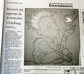
It seems as though my street art is generating some positive buzz in the community. Apparently the art has been discussed at a Vicksburg Village council meeting, It was written up in the local paper (shown above) and I've been approached by the Kalamazoo Gazette to be the focus of a feature article. I thought at some point I would be approached for some sort of news story. I didn't anticipate it happening as quick as it did.

Part of the charm of guerilla art is in it's anonymity. It's my intent to remain semi-anonymous as long as possible. As a result, I decided to write an "Artist Statement" explaining what I'm trying to accomplish. So, as in the case of the Gazette reporter requesting an interview I emailed him my statement and requested he email me any questions. Hopefully, in this way I can avoid actual interviews and control "my message" as much as possible. Time will tell how this all shakes out...

Here's the artist statement I emailed the reporter:

Who:

I’ve been a commercial artist for the last 10 years. I’ve been living in Vicksburg for nearly 3 years. I’ve created graphic design and illustration projects for clients such as Kellogg’s, Well’s Blue Bunny, Lender’s Bagels and the folks who brought you Moose Tracks ice cream to name a few.

I‘m currently the Creative Director for RED 7 STUDIOS, a soon to be announced graphic design studio specializing in unique marketing approaches. RED 7 STUDIOS is also responsible for sponsoring much of my public art.

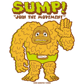
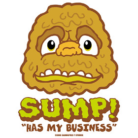
Sammo is a derivative of my real name. I sign my art using Sammo because it provides a level of anonymity and creates a sense of mystery. Everybody loves a mystery. Mysteries engage people’s imagination and that’s what I seek to do with my public art.

How it all began.

It all began when I came into ownership of 8 old books nobody wanted. Instead of throwing them away or donating them to the library I decided to come up with something unique to do with them. So I placed the 8 books under 8 different bridges on various river sections around Vicksburg (and a couple under the Centreville covered bridge). I tried to make the retrieval of these books only accessible by canoe or kayak.

Inside each book I taped a note encouraging the finder to place the book at another river location of their choosing. But first they were encouraged to email me where they found it and attach a photo of where they placed it next. Then I'd post the results on my blog. The hope was these 8 books would make their way to some unique river locations (hopefully outside the Vicksburg area). So was born the River Read Experiment.

Truthfully, I didn’t have high expectations for this experiment. I knew I was asking a lot from people to take a photo then send it to me. However, placing those books under bridges was certainly more fun than dropping them off at the library.

Less than a week later I received a surprise email from the “Inlet Troops” claiming they found 3 of the books. Here’s an excerpt from their email -

"My cousins and I found 3 of you're books on the inlet river to portage lake. We found "The Photo Drama of Creation", "Kept for the Master", and 'Shepherd of the Hills". We found them on May 29, my birthday! We should of been at church. Well any way, we took one of your books home to Munster Indiana to put under a bridge. We live about an hour southeast of chicago. My other cousins are from AnnHarbor Michigan, my grandparents have a cottage on portage lake.We started there and went all the way to kimble lake. We put one of your books way up the river.I'm really sorry but we didn't have a camera take a picture of where we found them.We didn't read the whole book but we did read a few pages of them, there old. My mom and aunt thought that this was absolutly the coolest idea ever.We do ,too. We hope your projectes well.

The Inlet Troops."

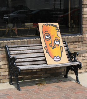
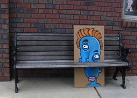
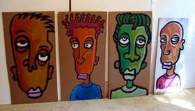
So after that initial experiment’s success, of which I thought would amount to nothing, I began thinking about other possibilities. Since I’m an artist, it was only natural to consider the possibility of leaving my art in easily accessible public places. So one evening, over the course of 2 hours, I sat down with a Sharpie marker and a stack of scrap paper and drew 60+ faces. I then printed labels with my email address and blog URL and affixed them to the back of each piece. The following day I took those 60 pieces of art and placed them around Centerville, Schoolcraft and Vicksburg.

I admit placing art in public for the first time was pretty awkward. It does take some getting used to seeing your art blown to the ground by the wind and having people walk over it. It’s also awkward at first because you think everyone is “onto you”. Eventually that insecurity fades and you become more comfortable placing the art. Sometimes it’s actually fun to take a big 17”x34” piece of art and place it in full view of people. If you act like you belong, people won’t question you.

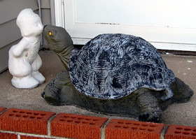
I should mention I’m not about making political statements or engaging in subversive activity with my art. The “guerilla art” or “street art” I create is really for the enjoyment of others. In fact, some of my favorite places to put my art is at the outdoor break tables of local manufacturers. If I had to work in a factory environment doing the same thing day in and day out, finding a piece of art would be a bright spot.

After my initial foray into placing public art in surrounding communities I decided to focus my artistic attention squarely on Vicksburg. I absolutely love Vicksburg. Having lived in the village for nearly three years there‘s no place I‘d rather be. Placing anonymous art around the village has been my way of encouraging people to look at their village with new eyes. It’s my desire to awaken people’s perceptions of how special Vicksburg is.

That being said, placing my guerilla art is only the beginning. One project that is currently underway involves a limited edition photography booklet highlighting different aspects of Vicksburg. RED 7 STUDIOS will be proudly sponsoring the publication. As with the guerilla art, this booklet will also be placed in public places for people to find. People should keep their eyes open. You never know when these booklets will hit the streets.

What the future holds:

Right now it’s about implementing fun ideas, generating buzz and getting people to look at their community more closely. In time, I envision the art in public places concept evolving to include contributions of guest artists and photographers whose work I admire.

In addition to art, I’d like to incorporate my interest in documentary “filmmaking” with alternative media driven projects. What that basically means is, instead of people finding drawings and paintings in public spaces they may find a limited edition DVD showcasing video profiles of interesting businesses in Vicksburg, interviews with unique local residents or maybe even a short film shot in Vicksburg. It’ll be projects like that, that I may need to lose my anonymity. But, for now I’m going to remain anonymous while showcasing how special Vicksburg is, using non-traditional methods.

Misc. Information and observations:

Art placed in heavy foot traffic areas doesn’t necessarily mean people will grab the art faster. It’s usually the opposite.

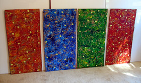
I like to create art using different themes and styles. I don’t want people to tire of a single style. Plus it’s more fun for me.

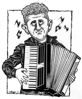
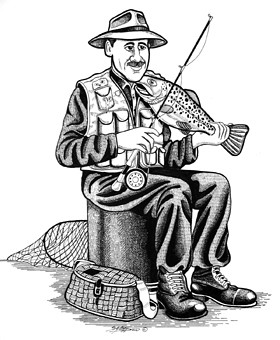
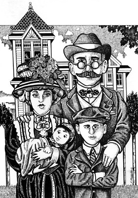
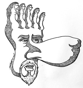
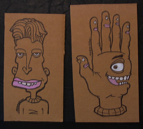
Faces tend to be the easiest and fastest to draw and paint.

My art will at times be bizarre but it’s never intended to offend.

I have never seen anyone take my art nor have I seen people’s reactions when they first see a piece. I will sometimes see my art hanging in a place of business though.

I tend to place my art during daylight hours unless they’re large pieces.

My characters tend not to smile because drawing teeth sometimes takes too long.

At first I would spend max 2 minutes per drawing. Now I spend a max of 10 minutes per drawing. I like the results better.

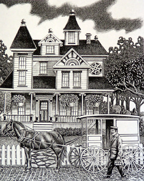
My 17”x34” cardboard paintings take between 20 minutes to an hour (per piece) to complete depending on complexity.

The longest piece of art left unclaimed was 6 days. It was in a heavy foot traffic area and very obvious.

I believe people respect each other’s property in the village to the point that they may be reluctant to take the art for themselves. I’m just guessing.

The riskiest area I placed art was the Vicksburg Police Department. I didn’t want to have to explain what I was doing but, I felt they might like some art.

I use the terms “guerilla art“, “street art” and “public art” interchangeably. I did receive an email from someone in Toronto calling my cardboard paintings "dropart". I found that term to be interesting.

Friday, September 09, 2005

More Oddities from the 'burg

Example
Example
Example

Vicksburg rarely disappoints in the oddity department. Yes, we really do have ATM machines in the ice dispensers, old shoes are often converted into planters and did I mention the school system excels at teaching kids how to spell?

Thursday, September 08, 2005

Archived Art - circa 1995 Wildlife

Example
Here's a piece I dug out from portfolios of days gone by. It was created in pen and ink using the stipple (tiny dot) technique. This piece represents the peak of that style for me. At the time I felt like there wasn't much I couldn't illustrate in that style. It wasn't long after that that I felt the need to change illustration styles to be more marketable (ie. working in color).

Wednesday, September 07, 2005

Park Bench Street Art Update

Example
Example

Of the 17 street art pieces I placed two days ago there were about four that remained unclaimed within the first twenty four hours. This wasn't all bad because it gave me an opportunity to get some photos. I couldn't get photos as I was placing them because it was too dark and I was trying not to be noticed.

****post script: I checked on these four pieces much later in the day and I'm pleased to say two were claimed. As for the other two (not shown) I moved them to more noticable places.****

Tuesday, September 06, 2005

The Dutch Boy is Back in Town

Example
Example

For the better part of a month I've been eyeing a house in my neighborhood. Reason being, this house has two yard sculptures perfect for the Kissing Dutch Boy project. I've been waiting for one of the homeowners to work in their yard so I could ask to get a photo or two of their yard sculptures. Fortunately, as I was driving around town placing my street art I noticed the homeowner's 18 year old son washing his truck. I briefly explained to him that I wanted to get a shot of the turtle with the dutch boy. He said that would be fine. Then he said "we got a gargoyle in the back if you want to get a shot of that too." OH YEAH!!! I wasn't even going to ask because I didn't want to take advantage of his hospitality. So I was pretty happy. Since he was so gracious I gave him one of my street art paintings... I think it was a fair trade.

Monday, September 05, 2005

Park Bench Street Art

Example
Example
Example
Example

I painted these with acrylics on corrugated cardboard. Each piece is about 17"x34". They will be placed between the slats of public benches sometime this evening... hopefully.

Friday, September 02, 2005

Archived Art - Coloring Poster 1996

Example
Example

Back in 1996 I had the idea of creating customized fire fighting coloring posters. The plan was to illustrate a generic poster leaving a large area at the top blank. If a fire department ordered the posters I would include the fire department's name in that area when printed. They could then take these customized posters to their fire safety demonstrations, school groups etc. At the time I decided not to market and promote the idea. That decision was largely based on the price of printing such a large poster (18"x24")... I doubted fire departments would want to pay $2.00 per poster.

Thursday, September 01, 2005

Archived Art - circa 1996

Example

This was a t-shirt design I illustrated back in '96 for the Softball World Series. At the time I was told it was a strong seller. I'm not sure if they're still selling it. All these years later I'm still pretty happy with it... and I don't say that about most of my work.